
Gold foil


£2.60


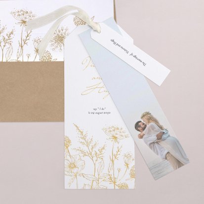
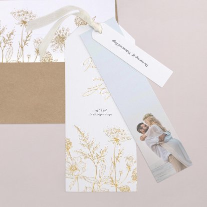
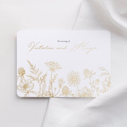
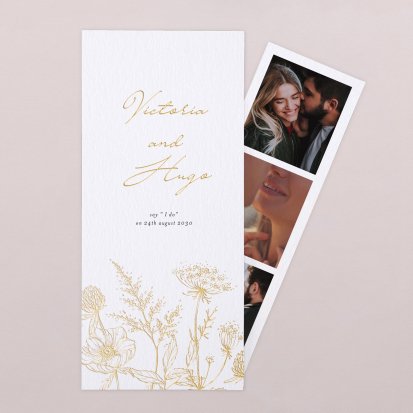
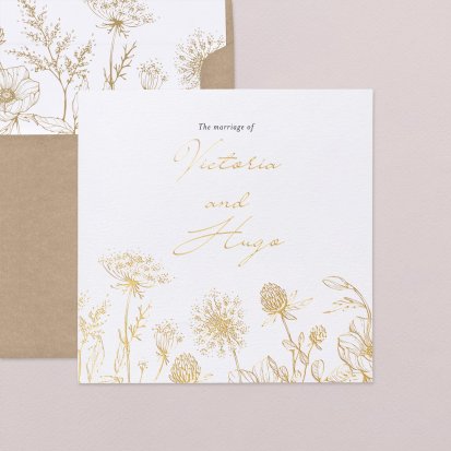
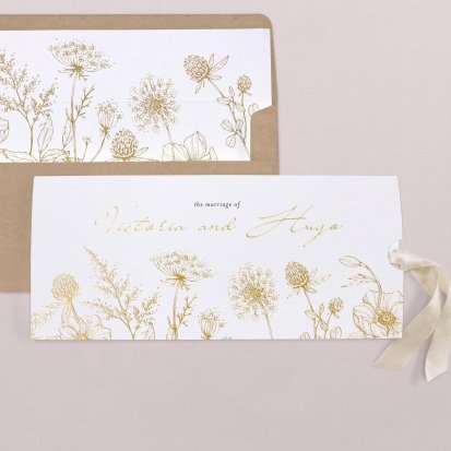
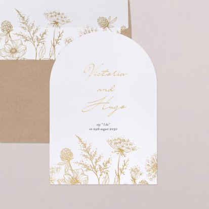
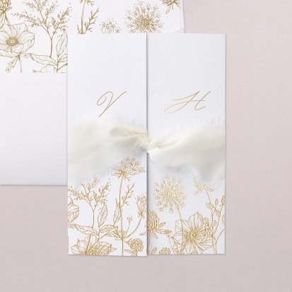
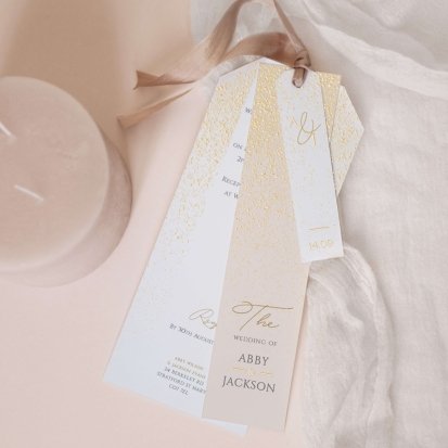
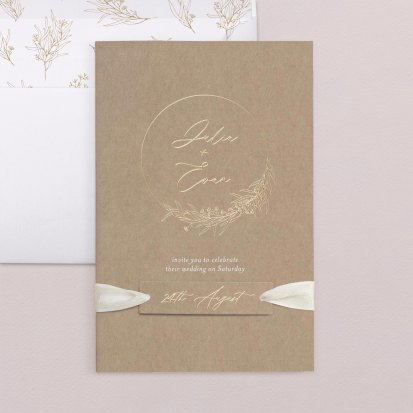
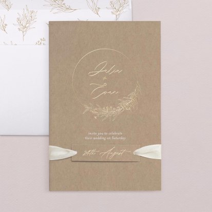
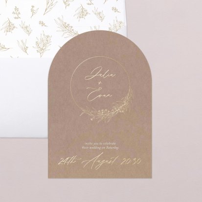
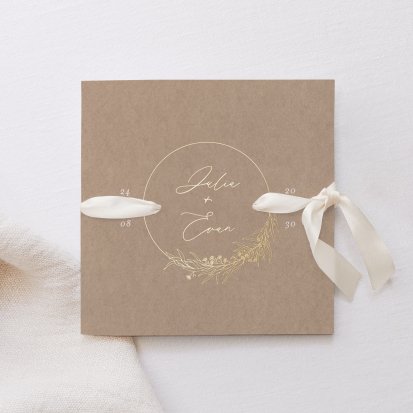
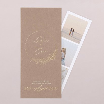
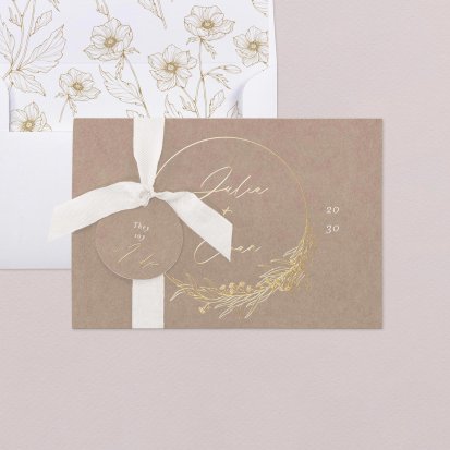
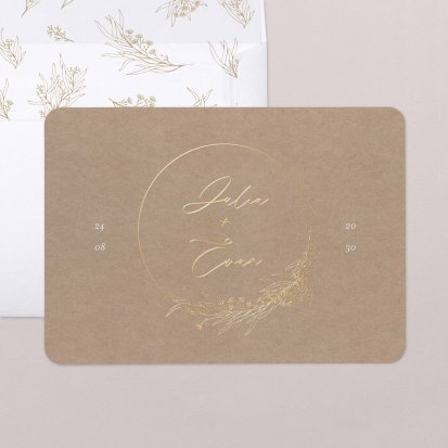
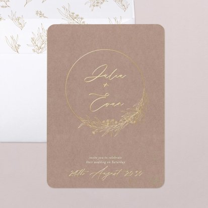
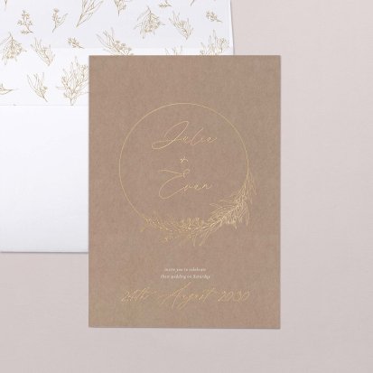
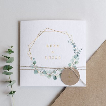
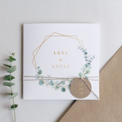
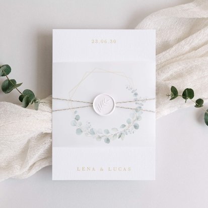
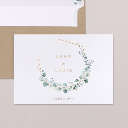
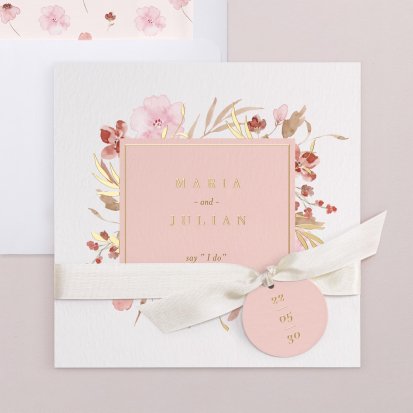
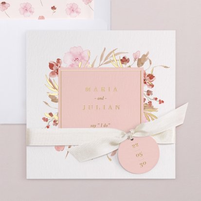
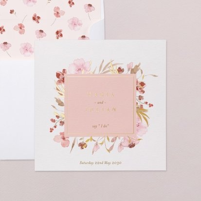
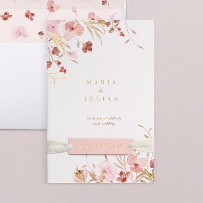
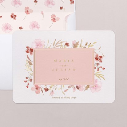
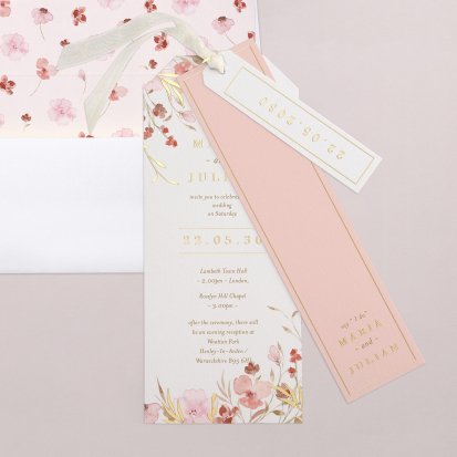
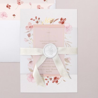
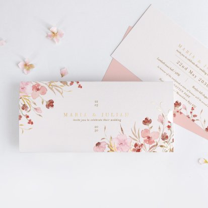
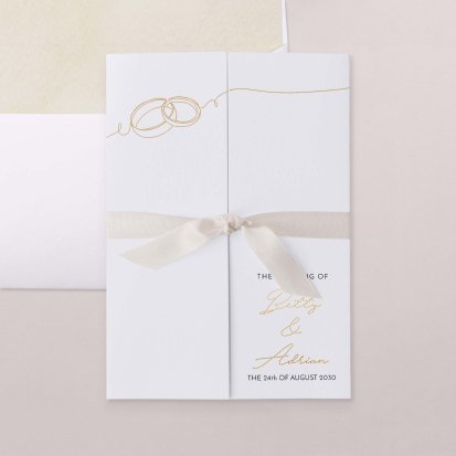
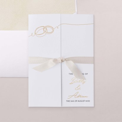
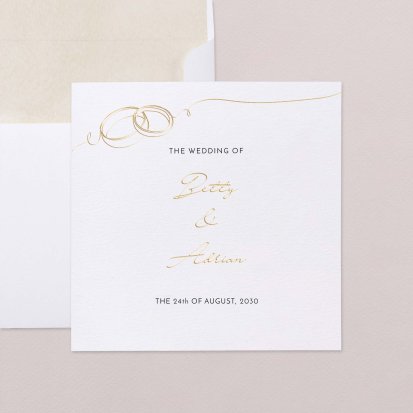
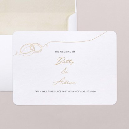
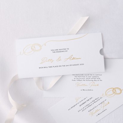
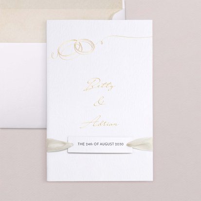
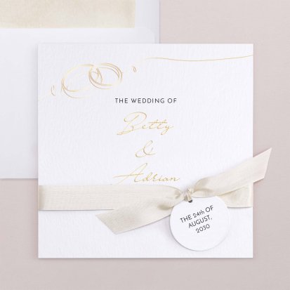
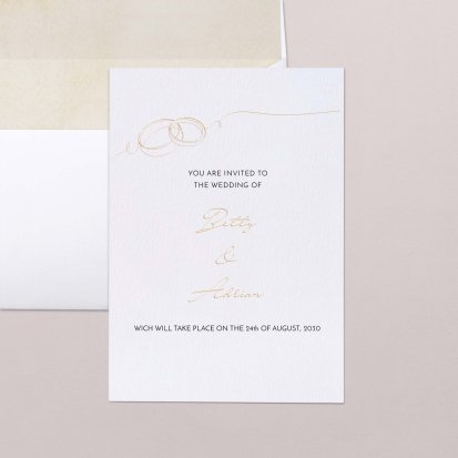
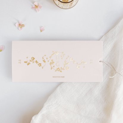
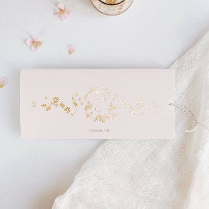
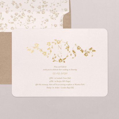
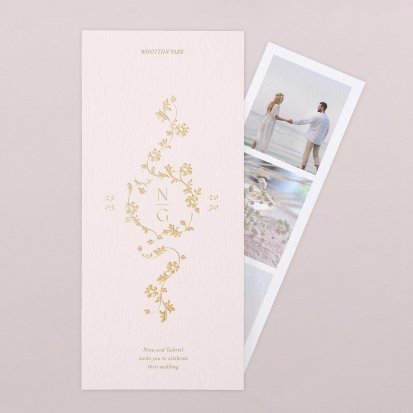
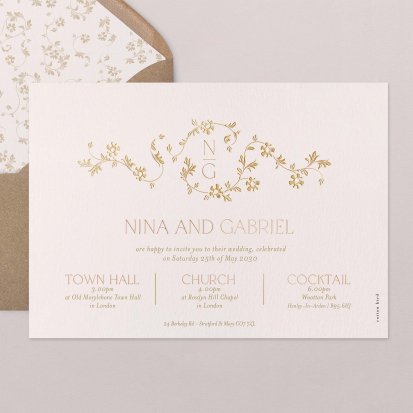
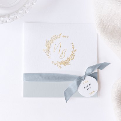
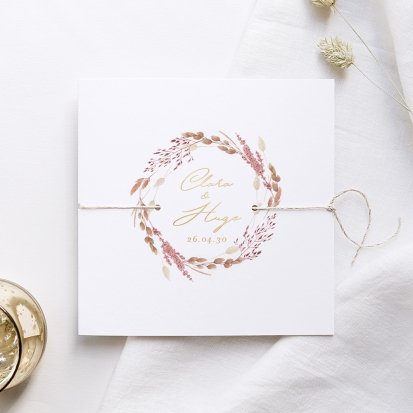
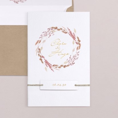
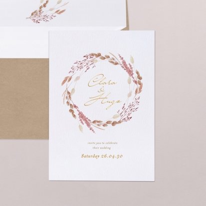
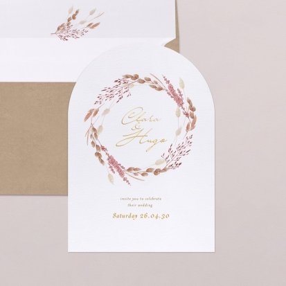
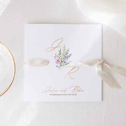
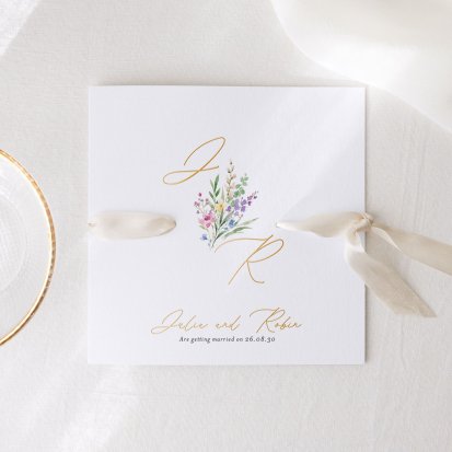
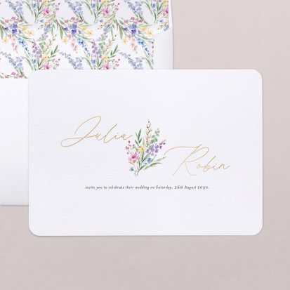
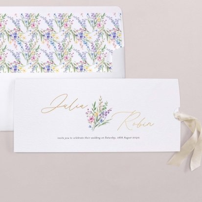
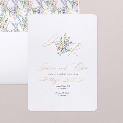
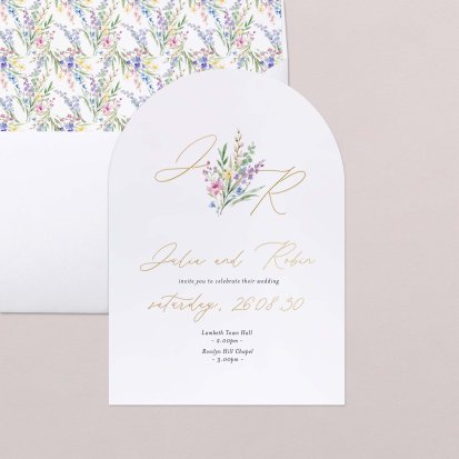
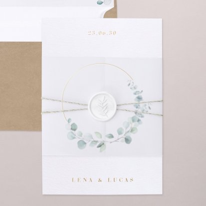
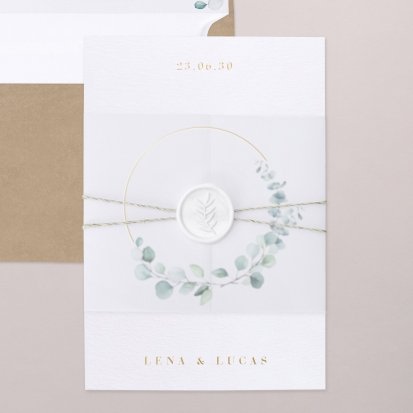
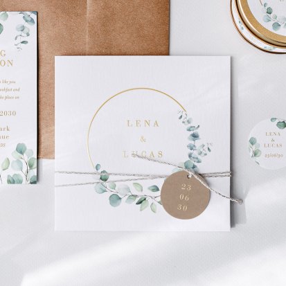
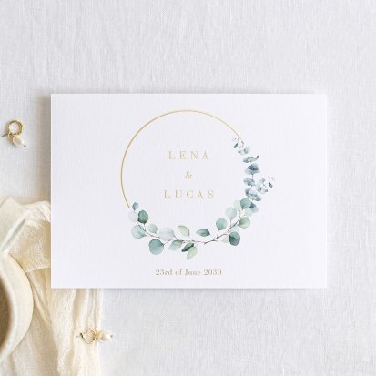
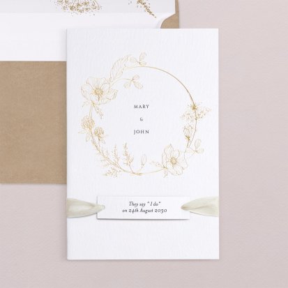
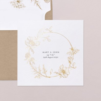
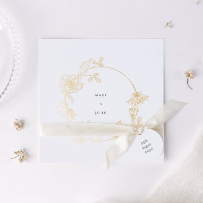
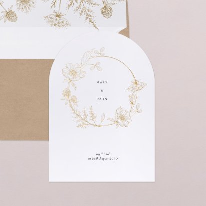
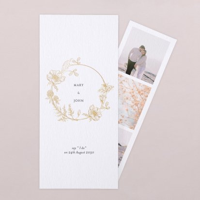
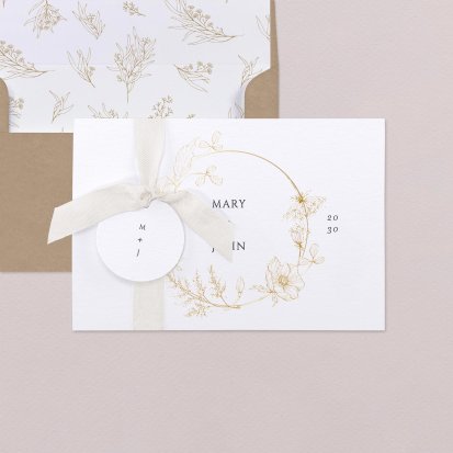
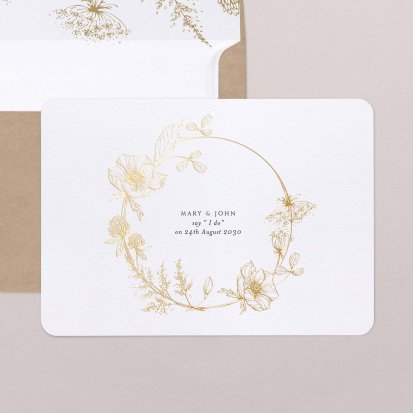
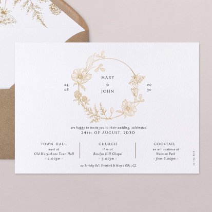
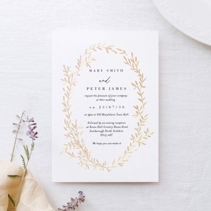
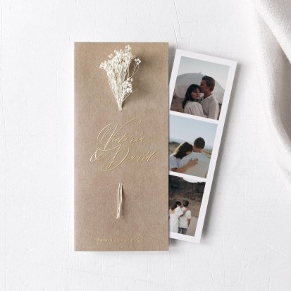
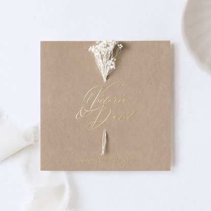
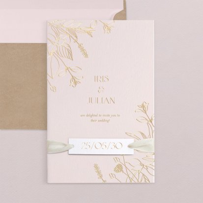
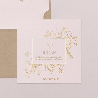
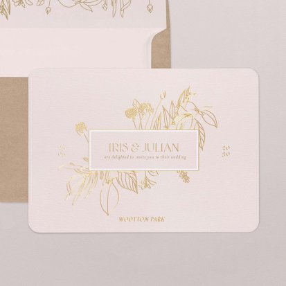
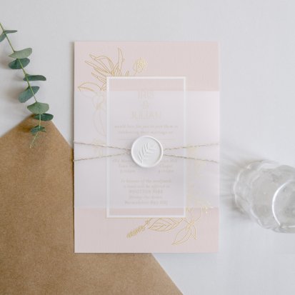
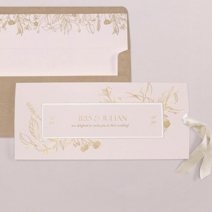
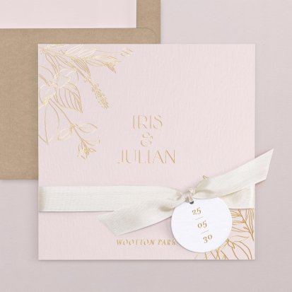
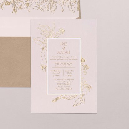
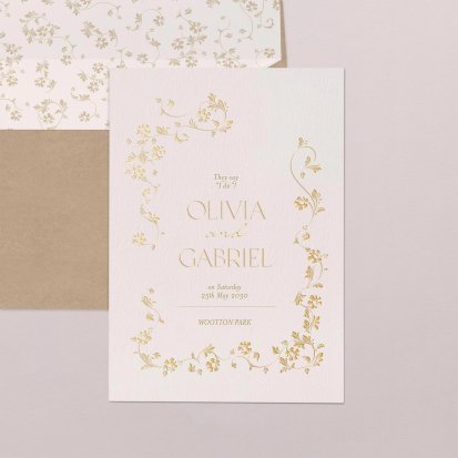
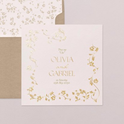
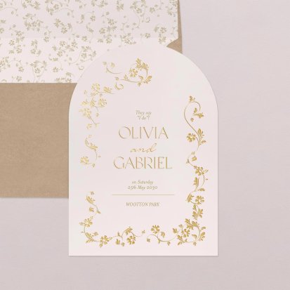
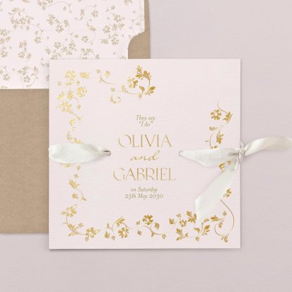
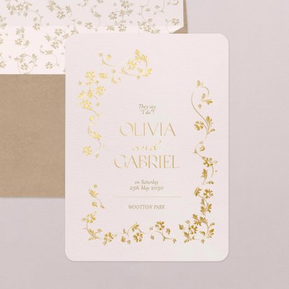
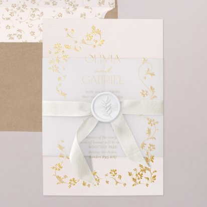
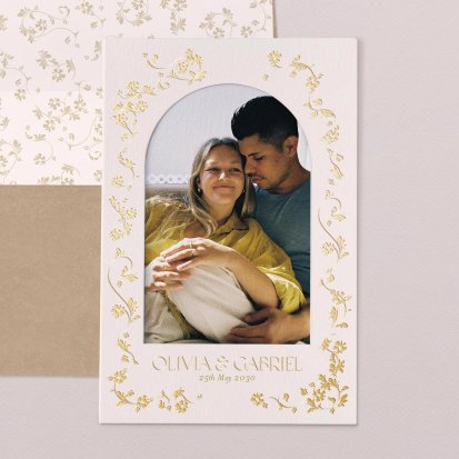
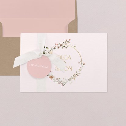
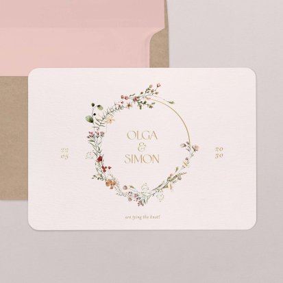
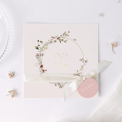
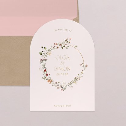
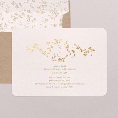
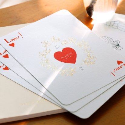
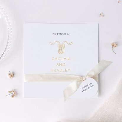
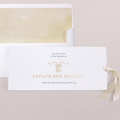
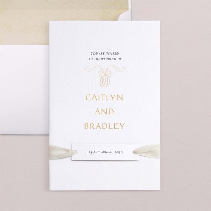
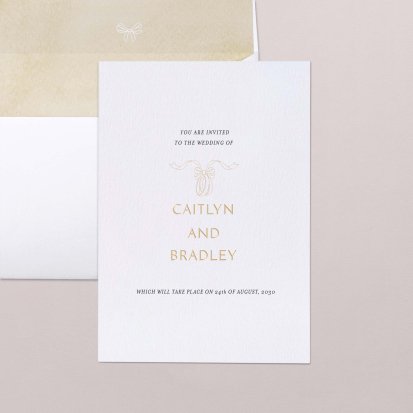
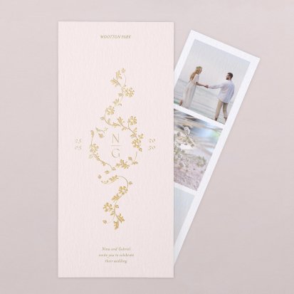
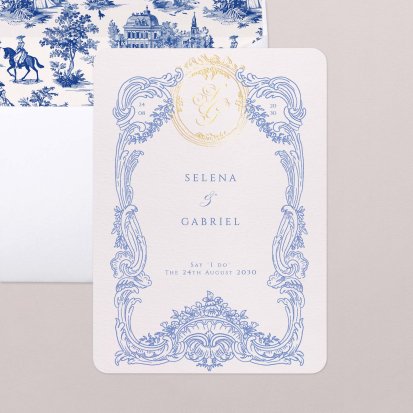
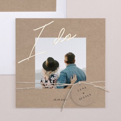
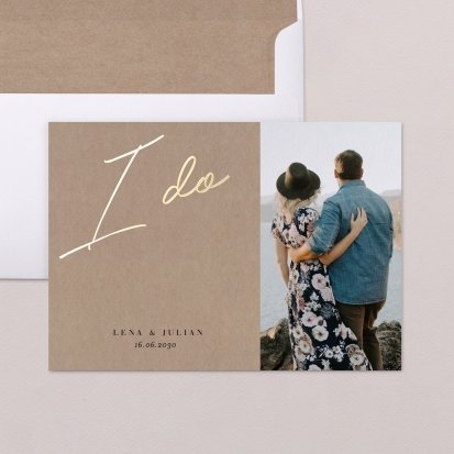
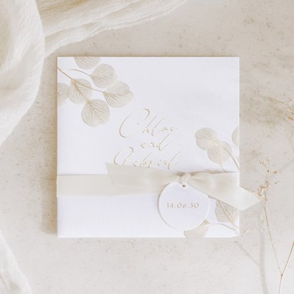
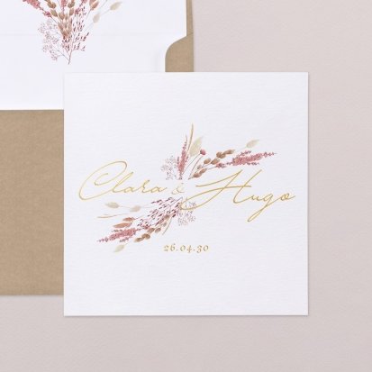
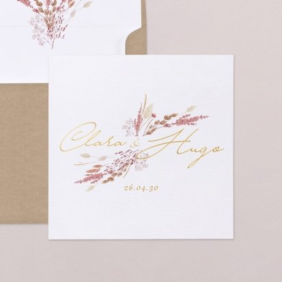
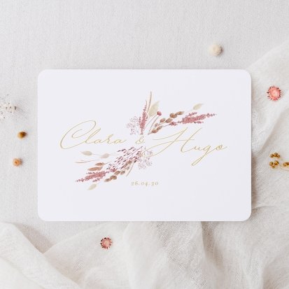
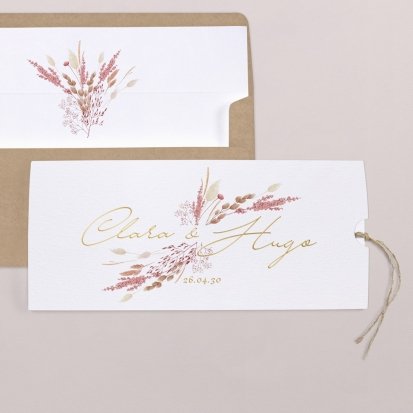
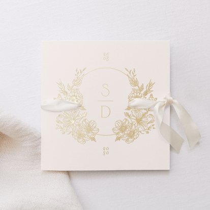
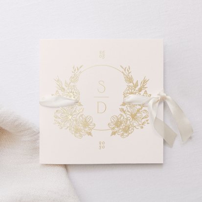
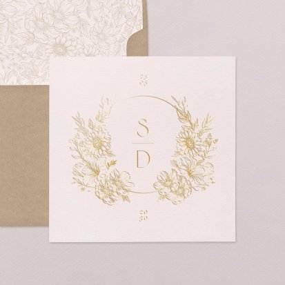
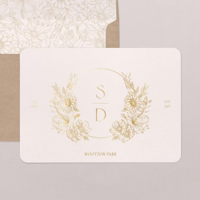
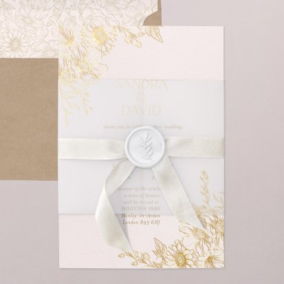
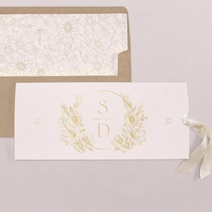
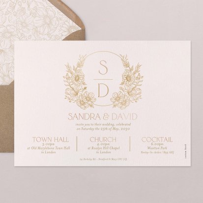
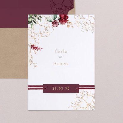
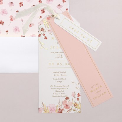
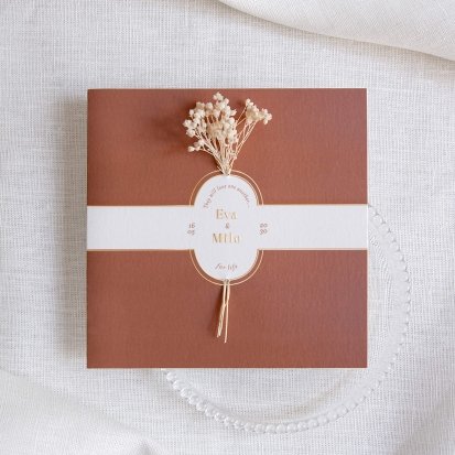
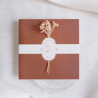
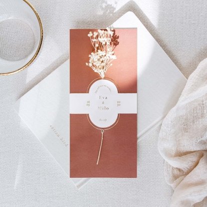
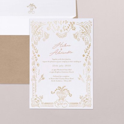
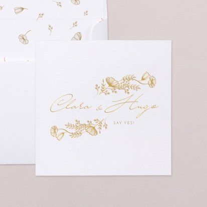
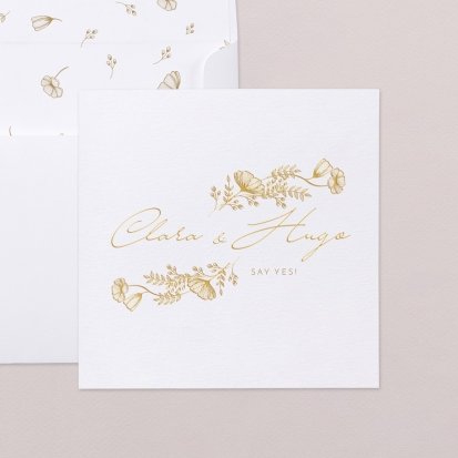
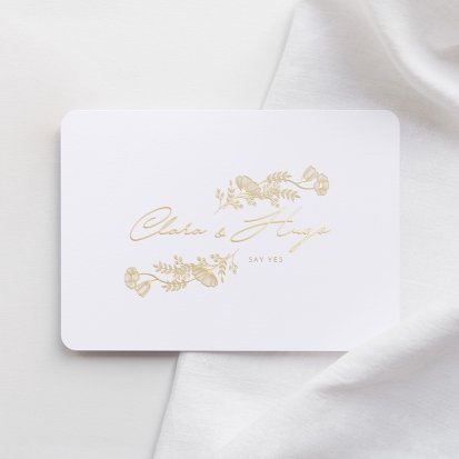
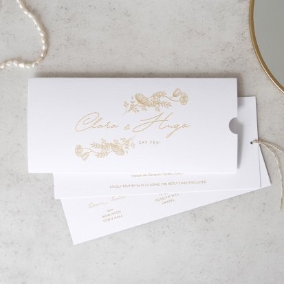
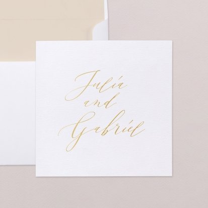
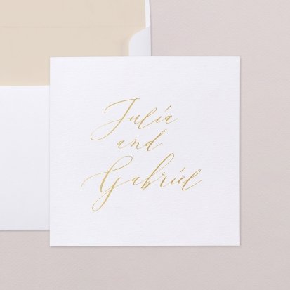
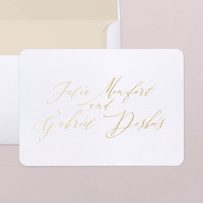
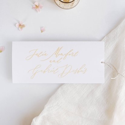
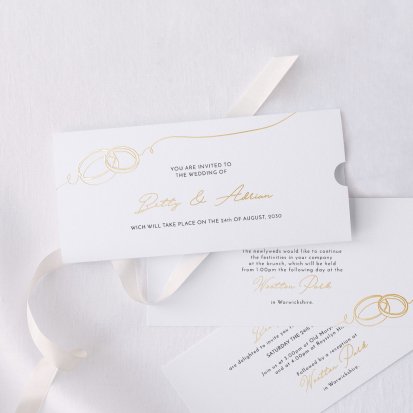
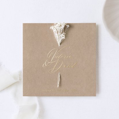
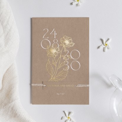
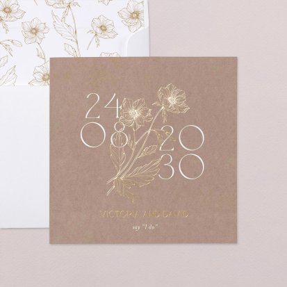
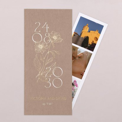
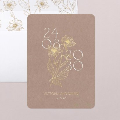
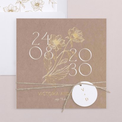
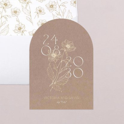
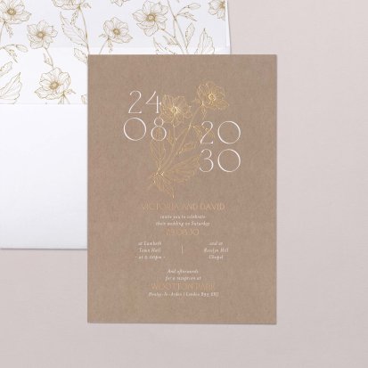
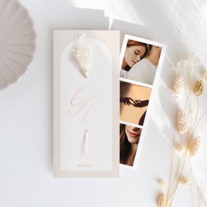
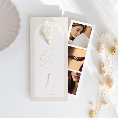
Every gold wedding invitation we make goes under the foiling press: a gold foil is applied with heat to your names or to the design, and it catches the light as soon as the card moves. The best way to judge it is to hold it: the foil appears on the samples.
Reset filters
202 designs


£2.60
£2.60
£3.18

£2.51
£2.51
£3.02
£3.09
£2.51
£2.51
£2.51

£2.62
£3.18
£2.07
£2.50
£3.18
£2.07

£2.51
£2.54
£2.64
£2.51
£2.44
£2.54
£2.64
£3.18
£2.51
£2.51
£2.51
£3.60
£2.60
£2.51
£2.07
£2.51
£2.51
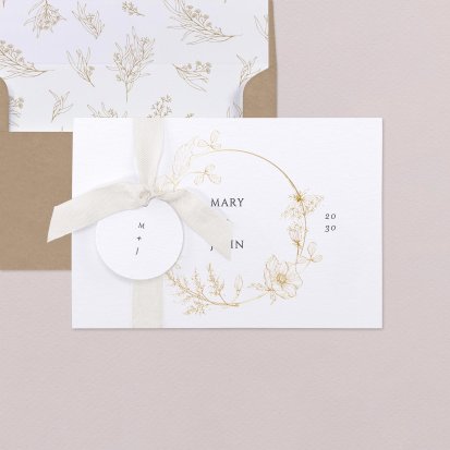
£3.54
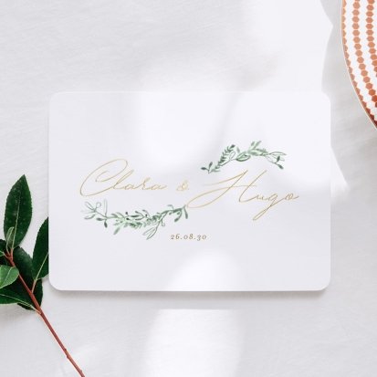
£2.54
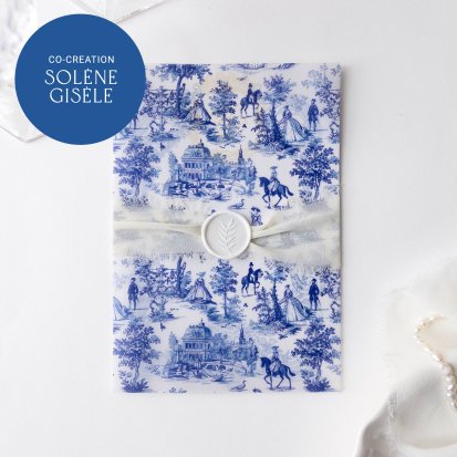
£2.72
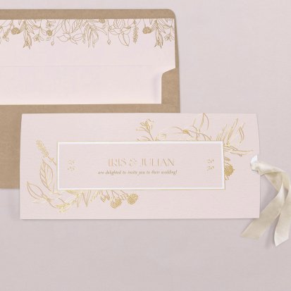
£3.09
£3.09
£2.51

£3.18
£3.18
£2.50
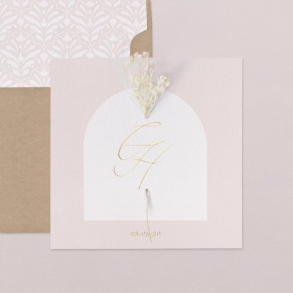
A ‘gold’ wedding invitation is not always hot foil stamped. Some are simply printed in a gold tone: you get a colour, not a shine. Hot foil stamping works differently. A heated plate presses a metallic foil onto the paper, and the foil only sticks to the engraved areas of the design. The result reflects light like metal. To test it, tilt the card towards a window: real foil changes as it catches the light, ink stays the same.
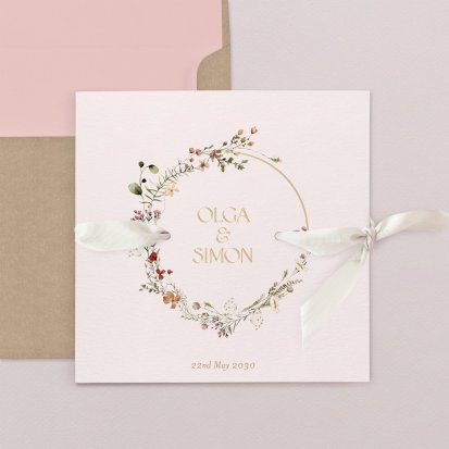
Gold draws the eye to whatever it covers. On an invitation, it is best to choose what you want to highlight: usually the names and the date, sometimes a border or a wreath of foliage framing the text. When the whole design is foiled, the rest works better kept simple.
Very fine lettering is not ideal for foiling, as the foil can fill the small gaps between strokes. That is a good reason to keep gold for the most visible elements.
On bright white, the contrast is crisp and the gold looks lighter, almost luminous. On ivory or cream, it blends in more and takes on a warmer, more vintage tone.
On a dark background, foil really comes into its own: the metallic foil stays opaque, where a light ink would lose intensity. If your palette leans towards darker shades, have a look at our burgundy, blue or black invitations too.
On textured creation paper, the gold follows the grain. It looks slightly less uniform than on smooth paper, which gives a more handcrafted finish.
Gold pairs naturally with ivory, green and burgundy. Copper, with its pinker tone, leans towards terracotta and kraft. Silver is cooler and suits blues, greys and bright white. If you want relief without a metallic effect, look at the varnish finish.
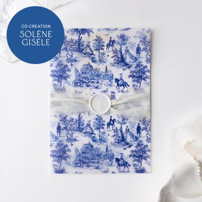
Among our gold foil designs, Brighton and Atlantide are new arrivals. Vienna is designed by illustrator Solène Gisèle.
Yes. You can order personalised samples with the gold finish. It is the only way to see the real shine before you confirm your order.
A screen cannot reproduce a metallic shine, so the preview shows the foiled area as a flat colour. On paper, it reacts to the light.
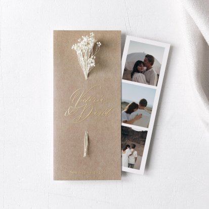
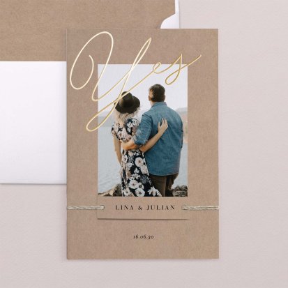
No. Hot foil stamping works on solid areas and lines, not on gradients or photos. On an invitation with a photo, other elements can be foiled: on Pure Gold, for example, the calligraphed names.
Content written by Lena Marker, Editorial Expert at the Cotton Bird workshops (view LinkedIn profile).